Task :
50대 이상 고령층의 이탈률이 높은 것은 가독성이나 인터페이스 불편 등 연령 특화 UX 부족 때문일 가능성이 있다.
•
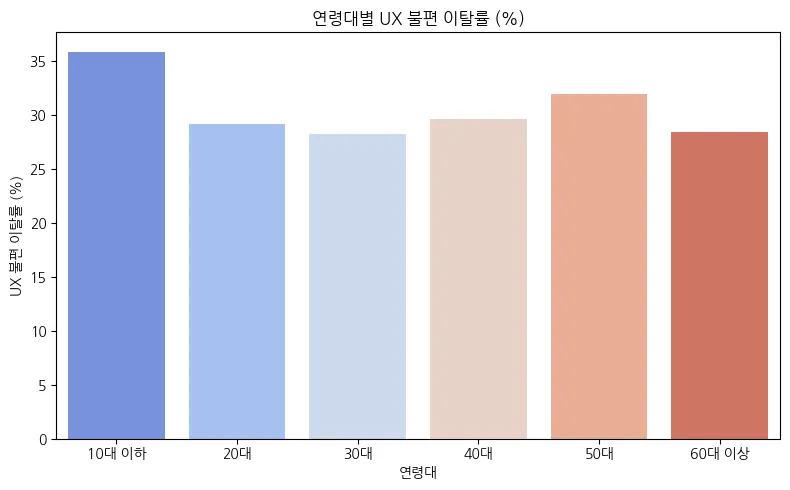
50대 이상 고령층 뿐만 아니라 모든 연령층에 대해 ux불편으로 인해 이탈율을 효과적으로 보기 위해 막대차트를 이용해 분석해본다.
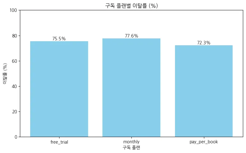
연령층(경제적 상황)에 따라 구독 유형이 비싸질수록 이탈률이 낮아질 것이다.
•
연령층/구독 유형/이탈률을 시각화 하기 위해 막대차트를 활용해서 분석한다.
실행 및 진행 사항 정리
# 50대 이상 고령층 뿐만 아니라 모든 연령층에 대해 ux불편으로 인해 이탈율을
# 효과적으로 보기 위해 막대차트를 이용해 분석해본다.
# age_group을 통한 ux불편 이탈률(%) 정의
ux_counts = merged_df[merged_df["dropout_reason_category"] == "UX 불편"].groupby("age_group").size()
total_counts = merged_df.groupby("age_group").size()
ux_rate_by_age = (ux_counts / total_counts * 100).fillna(0).reset_index(name="UX불편_이탈률(%)")
ux_rate_by_age
# 막대그래프로 age_group 별 ux불편 이탈률 시각화
plt.figure(figsize=(8, 5))
sns.barplot(data=ux_rate_by_age, x="age_group", y="UX불편_이탈률(%)", palette="coolwarm")
plt.title("연령대별 UX 불편 이탈률 (%)")
plt.xlabel("연령대")
plt.ylabel("UX 불편 이탈률 (%)")
plt.tight_layout()
plt.show()
Python
복사
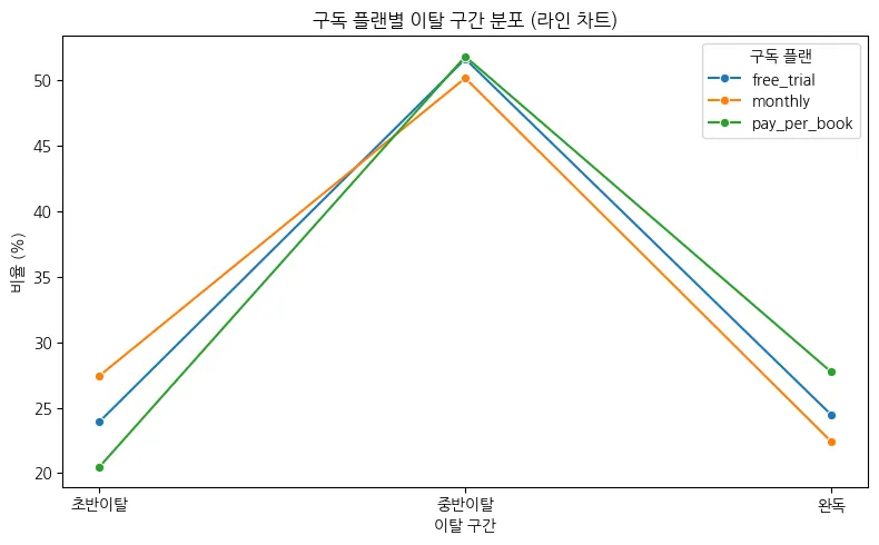
# 연령층/구독 유형/이탈률을 시각화 하기 위해 막대차트를 활용해서 분석한다.
# 성인/미성년자 구분을 위한 is_adult 파생 변수 생성
merged_df["is_adult"] = merged_df["age"] >= 20
# 이탈자 구분을 위한 is_dropout 컬럼
merged_df["is_dropout"] = merged_df["exit_position_numeric"] <= 75
# 이탈 구간을 나누기 위한 exit_position_numeric_group 컬럼
bins = [-1, 25, 75, 100]
labels = ['초반이탈', '중반이탈', '완독']
merged_df['exit_position_numeric_group'] = pd.cut(merged_df['exit_position_numeric'], bins=bins, labels=labels, right=True)
# 구독 유형별 이탈자 비율 시각화
grouped = merged_df.groupby(["subscription_plan", "exit_position_numeric_group"]).size().unstack(fill_value=0)
grouped_ratio = grouped.div(grouped.sum(axis=1), axis=0) * 100 # %로 변환
# 라인 차트를 위해 long-format으로 변환
line_data = grouped_ratio.reset_index().melt(id_vars="subscription_plan",
var_name="이탈 구간",
value_name="비율(%)")
plt.figure(figsize=(8, 5))
sns.lineplot(data=line_data, x="이탈 구간", y="비율(%)", hue="subscription_plan", marker="o")
plt.title("구독 플랜별 이탈 구간 분포 (라인 차트)")
plt.xlabel("이탈 구간")
plt.ylabel("비율 (%)")
plt.legend(title="구독 플랜")
plt.tight_layout()
plt.show()
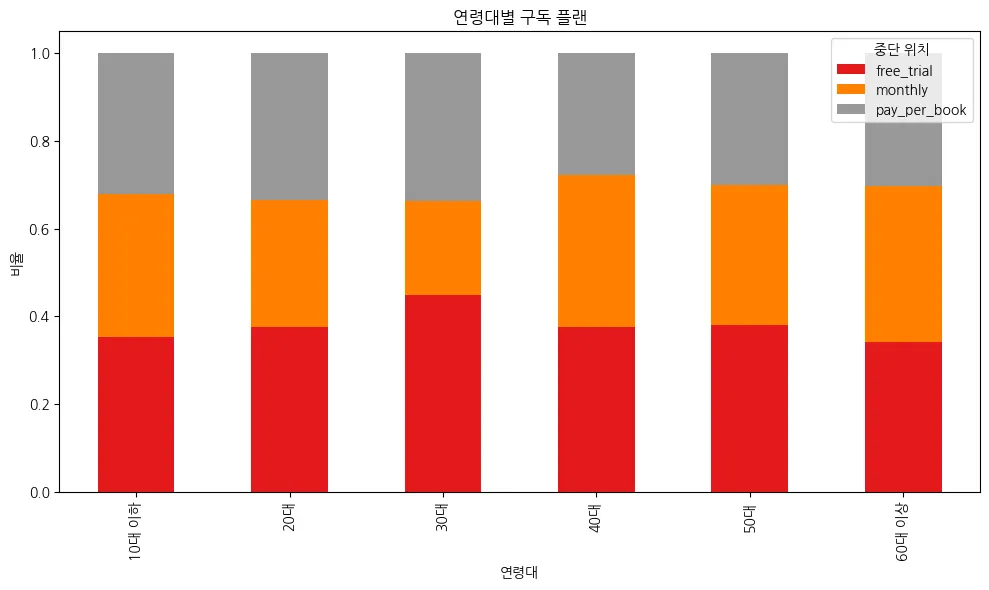
# 연령대별 구독 유형 시각화
grouped = merged_df.groupby(["age_group", "subscription_plan"]).size().unstack(fill_value=0)
# 비율(%)로 변환
grouped_ratio = grouped.div(grouped.sum(axis=1), axis=0)
grouped_ratio.plot(kind="bar", stacked=True, figsize=(10, 6), colormap="Set1")
plt.title("연령대별 구독 플랜")
plt.ylabel("비율")
plt.xlabel("연령대")
plt.legend(title="중단 위치")
plt.tight_layout()
plt.show()
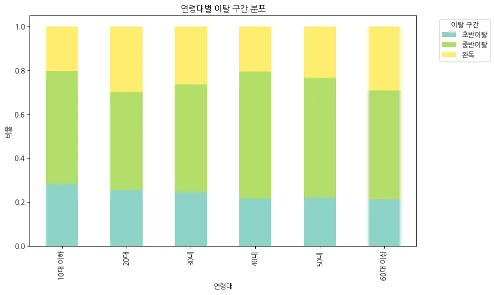
# 연령대별 이탈 구간 시각화
grouped = merged_df.groupby(["age_group", "exit_position_numeric_group"]).size().unstack(fill_value=0)
grouped_ratio = grouped.div(grouped.sum(axis=1), axis=0)
grouped_ratio.plot(kind="bar", stacked=True, figsize=(10, 6), colormap="Set3")
plt.title("연령대별 이탈 구간 분포")
plt.xlabel("연령대")
plt.ylabel("비율")
plt.legend(title="이탈 구간", bbox_to_anchor=(1.05, 1), loc='upper left')
plt.tight_layout()
plt.show()
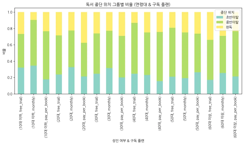
# 연령대 / 구독플랜 별 이탈구간 시각화
grouped = merged_df.groupby(["age_group", "subscription_plan", "exit_position_numeric_group"]).size().unstack(fill_value=0)
grouped_ratio = grouped.div(grouped.sum(axis=1), axis=0)
grouped_ratio.plot(kind="bar", stacked=True, figsize=(10, 6), colormap="Set3")
plt.title("독서 중단 위치 그룹별 비율 (연령대 & 구독 플랜)")
plt.ylabel("비율")
plt.xlabel("성인 여부 & 구독 플랜")
plt.legend(title="중단 위치")
plt.tight_layout()
plt.show()
Python
복사
결과