Task :
•
1.구독료 별로 이탈률이 다를 것이다
•
2.개별 구매가 완독을 할 경향이 높으며 ,초반에서의 이탈률은 대부분 구독을 이용하고 있는 사람들이다.
실행 및 진행 사항 정리
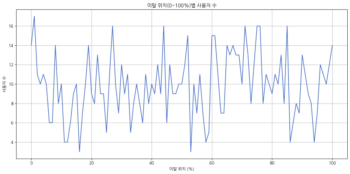
이탈율 나누기 위한 라인 그래프
import pandas as pd
import matplotlib.pyplot as plt
# CSV 파일 불러오기
df1
# exit_position_numeric 값을 정수로 변환
df1['exit_position_numeric'] = df1['exit_position_numeric'].round().astype(int)
# 0~100 범위로 정렬된 사용자 수 집계
exit_counts = df1['exit_position_numeric'].value_counts().sort_index()
# 누락된 값이 없도록 0~100 범위를 모두 포함
full_range = pd.Series(0, index=range(0, 101))
exit_counts_full = full_range.add(exit_counts, fill_value=0)
# 한글 폰트 설정
plt.rcParams['font.family'] = 'NanumGothic' # Windows
# plt.rcParams['font.family'] = 'AppleGothic' # macOS
# 라인 차트 시각화
plt.figure(figsize=(12, 6))
plt.plot(exit_counts_full.index, exit_counts_full.values, color='royalblue')
plt.title('이탈 위치(0~100%)별 사용자 수')
plt.xlabel('이탈 위치 (%)')
plt.ylabel('사용자 수')
plt.grid(True)
plt.tight_layout()
plt.show()
Python
복사
import pandas as pd
import matplotlib.pyplot as plt
# 데이터 수동 입력 (사용자가 제공한 표 기반)
data = {
'subscription_plan': ['free_trial', 'free_trial', 'free_trial',
'monthly', 'monthly', 'monthly',
'pay_per_book', 'pay_per_book', 'pay_per_book'],
'new_exit_position_numeric': ['middle_to_later_part', 'finished_reading', 'beginning',
'middle_to_later_part', 'beginning', 'finished_reading',
'middle_to_later_part', 'finished_reading', 'beginning'],
'count': [65.0, 30.666667, 30.0, 51.666667, 27.666667, 22.333333,
55.0, 29.666667, 21.333333]
}
df = pd.DataFrame(data)
# 한글 폰트 설정
plt.rcParams['font.family'] = 'NanumGothic' # Windows
# plt.rcParams['font.family'] = 'AppleGothic' # macOS
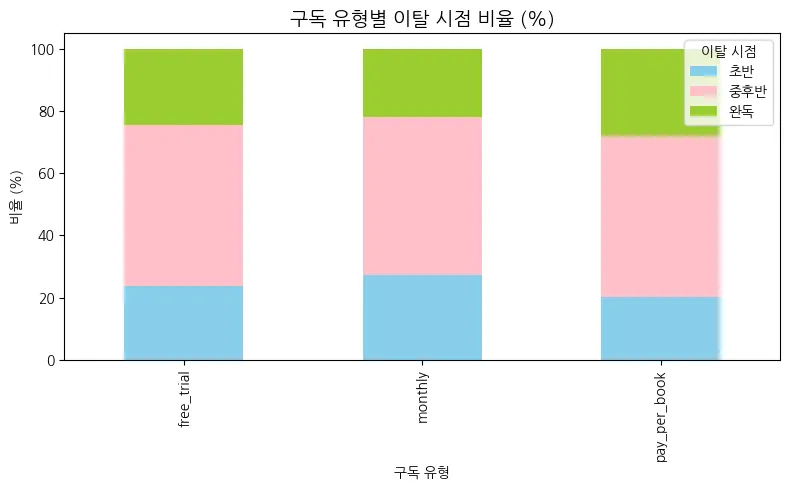
# 시각화: 구독유형별 이탈 시점 막대그래프
import seaborn as sns
plt.figure(figsize=(10, 6))
sns.barplot(data=df, x='new_exit_position_numeric', y='count', hue='subscription_plan')
plt.title('구독 유형별 이탈 시점 평균 사용자 수')
plt.xlabel('이탈 시점')
plt.ylabel('평균 사용자 수')
plt.legend(title='구독 유형')
plt.tight_layout()
plt.show()
Python
복사
import pandas as pd
import matplotlib.pyplot as plt
import matplotlib.font_manager as fm
# 데이터 구성
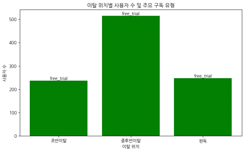
data = {
'new_exit_position_numeric': ['초반이탈', '중후반이탈', '완독'],
'count': [237, 515, 248],
'top': ['free_trial', 'free_trial', 'free_trial']
}
df = pd.DataFrame(data)
# 한글 폰트 설정 (선택 사항)
plt.rcParams['font.family'] = 'NanumGothic'
# 시각화
plt.figure(figsize=(8, 5))
bars = plt.bar(df['new_exit_position_numeric'], df['count'], color='green')
# 막대 위에 top 구독 유형 표시
for bar, label in zip(bars, df['top']):
yval = bar.get_height()
plt.text(bar.get_x() + bar.get_width()/2, yval + 5, label, ha='center', fontsize=10)
plt.title('이탈 위치별 사용자 수 및 주요 구독 유형')
plt.xlabel('이탈 위치')
plt.ylabel('사용자 수')
plt.tight_layout()
plt.show()
Python
복사
결과

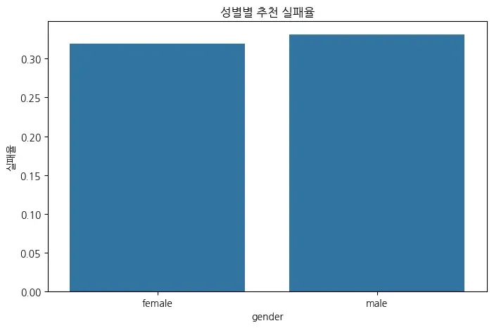
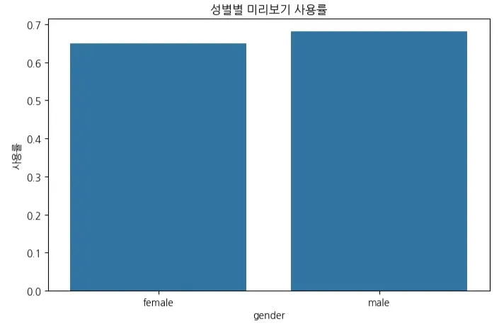
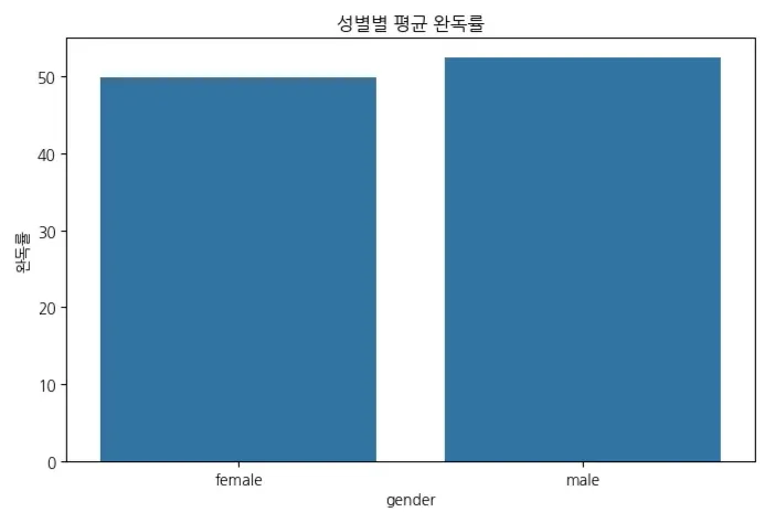
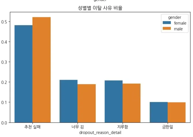
성별