
.png&blockId=21b2dc3e-f514-818b-b72b-f9aade6351bf)

Task : (1단계)
(1단계)•
대도시(neighbourhood_group) 단위로:
◦
숙소 수 확인
◦
방타입 구성 비율 확인
◦
방타입별 가격 분포 예측 가능
대도시별 전체 숙소 수
import matplotlib.pyplot as plt
plt.figure(figsize=(8, 5))
bars = plt.bar(city_counts['neighbourhood_group'], city_counts['listing_count'])
# 라벨 붙이기
for bar in bars:
height = bar.get_height()
plt.text(bar.get_x() + bar.get_width()/2, height + 200, f'{height}',
ha='center', va='bottom', fontsize=10, fontweight='bold')
plt.title('대도시별 전체 숙소 수')
plt.xlabel('대도시 (neighbourhood_group)')
plt.ylabel('숙소 수')
plt.tight_layout()
plt.show()
Python
복사
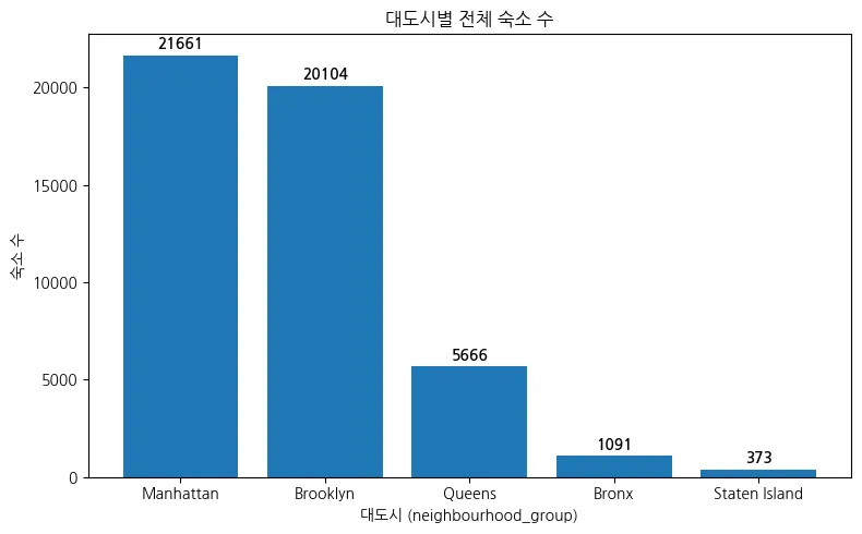
⇒맨해튼에 가장 많이 분포함.
⇒블루클린도 맨해튼 이랑 거의 비등하게 있음.
지역 별 평균 숙박 가격
import matplotlib.pyplot as plt
import numpy as np
# 지역별 평균 가격 구하기
region_price_stats = df.groupby('neighbourhood_group')['price'].agg(['mean', 'median', 'max', 'count']).sort_values(by='mean')
# 평균값 반올림 (소수점 1자리)
rounded_means = region_price_stats['mean'].round(1)
# 시각화
plt.figure(figsize=(8, 6))
bars = plt.bar(rounded_means.index, rounded_means.values)
# 라벨 추가 (막대 위에 평균 가격 표시)
for bar, value in zip(bars, rounded_means):
plt.text(bar.get_x() + bar.get_width()/2, bar.get_height() + 5, f'{value}',
ha='center', va='bottom', fontsize=10, fontweight='bold')
plt.title('지역별 평균 숙박 가격 (반올림)')
plt.xlabel('지역 (neighbourhood_group)')
plt.ylabel('평균 가격 ($)')
plt.xticks(rotation=45)
plt.tight_layout()
plt.show()
Python
복사
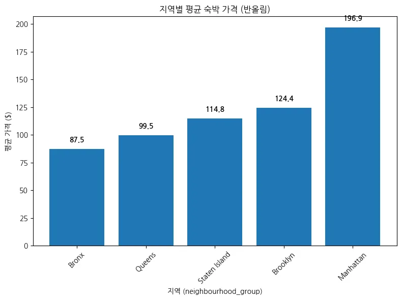
맨해튼은 가장 많은 숙소를 보유하고, 숙박 가격 평균 또한 가장 높음.
대도시 별 방타입 구성( 숙소 수)
import matplotlib.pyplot as plt
import seaborn as sns
# 데이터 준비
roomtype_counts = df.groupby(['neighbourhood_group', 'room_type']).size().reset_index(name='count')
# 시각화
plt.figure(figsize=(10, 6))
ax = sns.barplot(data=roomtype_counts, x='neighbourhood_group', y='count', hue='room_type')
# 막대 위에 값 표시 (굵게, 중앙 정렬)
for container in ax.containers:
ax.bar_label(container, fmt='%d', label_type='edge', fontsize=10, fontweight='bold')
# 그래프 제목 및 축
plt.title('대도시별 방타입 구성 (숙소 수)', fontsize=14, fontweight='bold')
plt.xlabel('대도시 (neighbourhood_group)', fontsize=12)
plt.ylabel('숙소 수', fontsize=12)
plt.legend(title='Room Type')
plt.tight_layout()
plt.show()
Python
복사
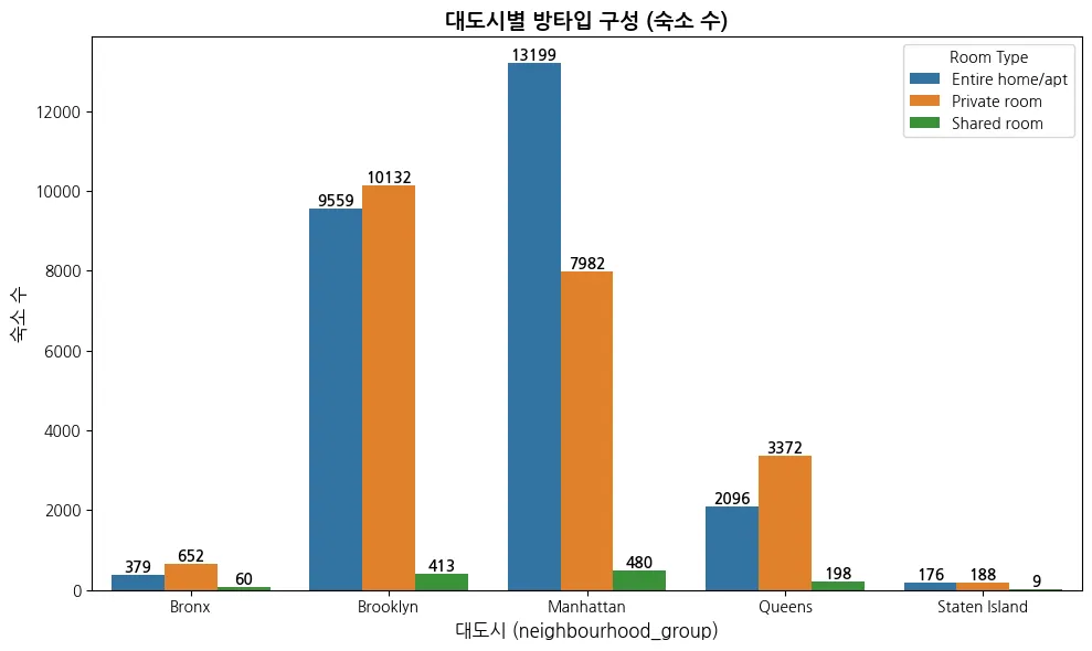
맨해튼의 평균가격대가 높은 이유는 아파트 형태의 숙소가 많기 때문이다.
⇒ 가격대가 높은 것들을 함부로 제거하면 안 됨.
⇒2번째로 분포 비율이 높은 블루 클린은 개인방이 더 많음.
⇒ shared room 의 수가 굉장히 적다.
방타입(room_type)별 특징 정리 Entire home/apt (집 전체 사용) 설명: 아파트나 주택 전체를 단독으로 사용하는 형태. 프라이버시가 완전히 보장됨.
주요 수요층: 커플, 가족 단위 여행자, 중장기 체류자
가격대: 전체 중 가장 높음 (고급 숙소 중심)
지역 분포 특징: → 도심 한복판보다는 주택가, 도심 외곽 인근에 많이 분포하는 경향 있음
Private room (개인 방 사용) 설명: 호스트와 같은 집을 공유하지만, 방 하나만 단독 사용하는 형태
주요 수요층: 1인 여행자, 젊은 층, 예산을 줄이려는 방문객
가격대: 중간 수준
지역 분포 특징: → 도심에 더 많이 분포 → 고가 지역에서 저렴한 대안 숙박 형태로 자리 잡고 있음
Shared room (공유 방) 설명: 방 하나도 다른 투숙객과 함께 사용하는 형태, 도미토리와 유사
주요 수요층: 초저예산 여행자, 젊은 개인 여행객
가격대: 가장 낮음
지역 분포 특징: → 숙소 수 자체가 매우 적고, 수요도 낮음
2단계1.
대도시별 포함된 동네 수 확인
2.
지역별 숙소 분포 비율 확인.
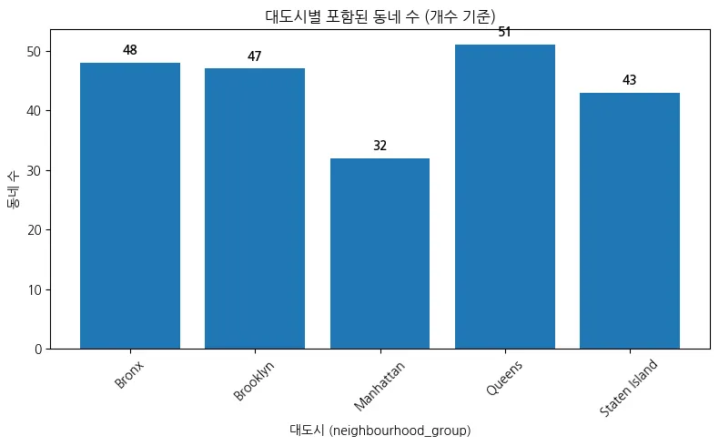
대도시별 포함된 동네 수( 개수 기준)
import pandas as pd
import matplotlib.pyplot as plt
# 1️⃣ 대도시별 동네 수 세기
city_neigh_counts = df.groupby('neighbourhood_group')['neighbourhood'].nunique().reset_index()
city_neigh_counts.columns = ['neighbourhood_group', 'num_neighbourhoods']
# 2️⃣ 표 출력
print("📋 대도시별 포함된 동네 수")
display(city_neigh_counts) # 주피터/콜랩 환경에서는 이게 예쁘게 출력됨
# 3️⃣ 막대그래프 시각화
plt.figure(figsize=(8, 5))
bars = plt.bar(city_neigh_counts['neighbourhood_group'], city_neigh_counts['num_neighbourhoods'])
# 숫자 라벨 추가
for bar in bars:
height = bar.get_height()
plt.text(bar.get_x() + bar.get_width()/2, height + 1, f'{int(height)}',
ha='center', va='bottom', fontsize=10, fontweight='bold')
plt.title('대도시별 포함된 동네 수 (개수 기준)')
plt.ylabel('동네 수')
plt.xlabel('대도시 (neighbourhood_group)')
plt.xticks(rotation=45)
plt.tight_layout()
plt.show()
Python
복사
전체 고유한 지역 수 확인
# 전체에서 고유한 지역 수 확인
num_neighbourhoods = df['neighbourhood'].nunique()
print(f"전체 지역(동네)의 수는 총 {num_neighbourhoods}개입니다.")
Python
복사

지역별 방타입 비율
1.
맨해튼 지역별 방타입 비율
# 피벗: 대도시 + 동네를 인덱스로, room_type을 컬럼으로
pivot_df = roomtype_ratio.pivot_table(
index=['neighbourhood_group', 'neighbourhood'],
columns='room_type',
values='ratio',
fill_value=0
).reset_index()
Python
복사
import matplotlib.pyplot as plt
# 맨해튼 필터링
manhattan_df = pivot_df[pivot_df['neighbourhood_group'] == 'Manhattan']
# 인덱스 설정
manhattan_df = manhattan_df.set_index('neighbourhood')
# 방타입만 선택 (비율)
room_types = ['Entire home/apt', 'Private room', 'Shared room']
manhattan_df = manhattan_df[room_types]
# 시각화
manhattan_df.plot(kind='bar', stacked=True, figsize=(12, 6))
plt.title('🗽 맨해튼 지역별 방타입 비율')
plt.ylabel('비율 (%)')
plt.xlabel('동네')
plt.xticks(rotation=45, ha='right')
plt.legend(title='Room Type')
plt.tight_layout()
plt.show()
Python
복사
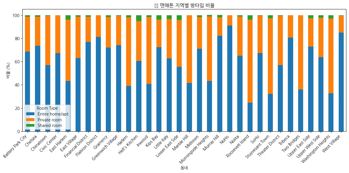
⇒ 확인 결과, 대부분 지역이 ‘Entire home/apt’ 형태임.
⇒ 하지만, 'Private room' 형태가 아파트 형태보다 많은 곳도 있음.
2.
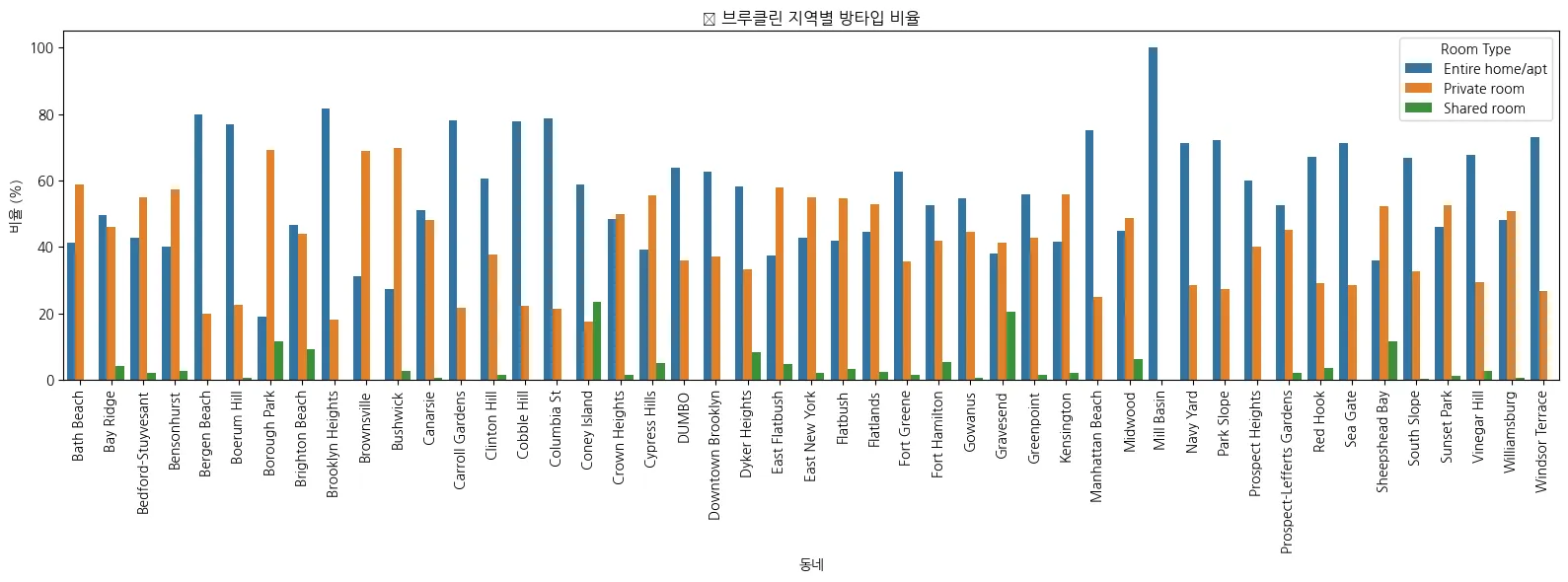
브루클린 지역별 방타입 비율
import matplotlib.pyplot as plt
import seaborn as sns
# 브루클린 데이터만 추출
brooklyn = roomtype_ratio[roomtype_ratio['neighbourhood_group'] == 'Brooklyn']
# 시각화
plt.figure(figsize=(16, 6))
sns.barplot(
data=brooklyn,
x='neighbourhood',
y='ratio',
hue='room_type'
)
plt.title('🏙 브루클린 지역별 방타입 비율')
plt.xlabel('동네')
plt.ylabel('비율 (%)')
plt.xticks(rotation=90)
plt.legend(title='Room Type')
plt.tight_layout()
plt.show()
Python
복사
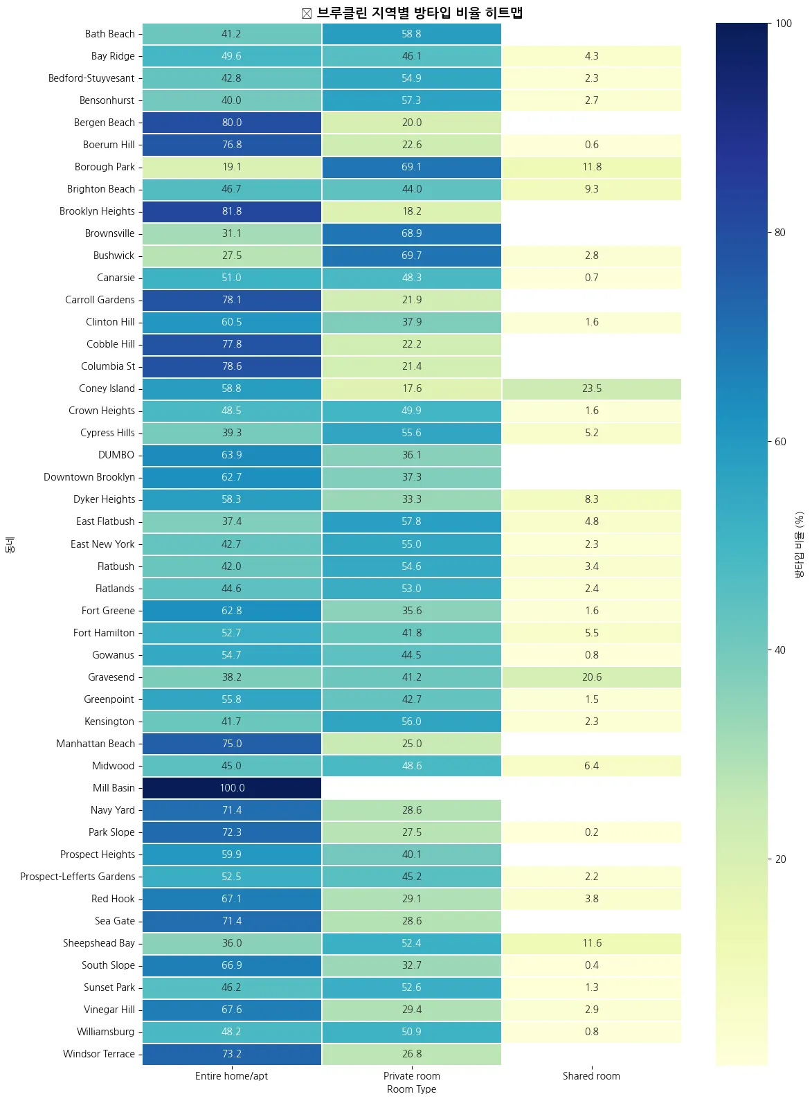
히트맵 시각화
import matplotlib.pyplot as plt
import seaborn as sns
# 브루클린 데이터만 피벗
brooklyn_pivot = roomtype_ratio[roomtype_ratio['neighbourhood_group'] == 'Brooklyn'] \
.pivot(index='neighbourhood', columns='room_type', values='ratio')
# 히트맵 그리기
plt.figure(figsize=(12, 16))
sns.heatmap(
brooklyn_pivot,
annot=True, # 숫자 표시
fmt='.1f', # 소수점 한 자리
cmap='YlGnBu', # 색상맵
linewidths=0.3, # 셀 사이 경계선
cbar_kws={'label': '방타입 비율 (%)'} # 색상바에 라벨 추가!
)
plt.title('🔥 브루클린 지역별 방타입 비율 히트맵', fontsize=14, fontweight='bold')
plt.xlabel('Room Type')
plt.ylabel('동네')
plt.xticks(rotation=0)
plt.tight_layout()
plt.show()
Python
복사
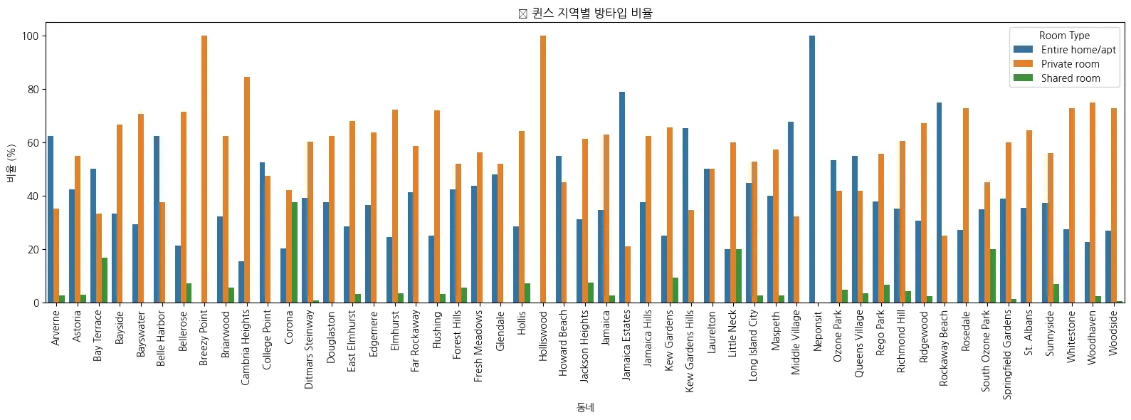
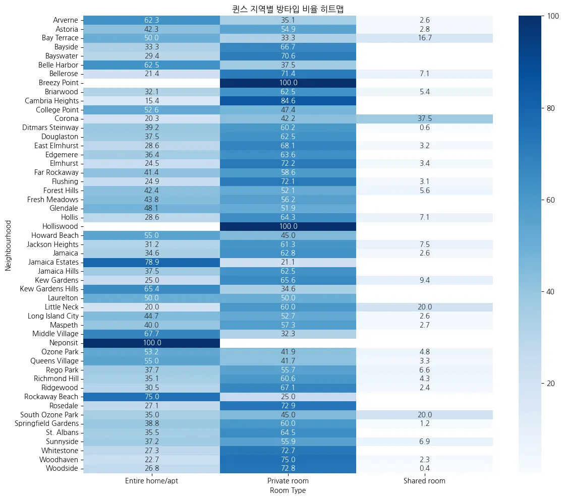
3.
Queens 지역별 방타입
import pandas as pd
import matplotlib.pyplot as plt
import seaborn as sns
# 데이터 불러오기
df = pd.read_csv('AB_NYC_2019.csv') # 파일 경로에 맞게 수정해주세요!
# 1. 지역별 방타입 숙소 수 계산
roomtype_by_area = df.groupby(['neighbourhood_group', 'neighbourhood', 'room_type']).size().reset_index(name='count')
# 2. 동네별 총 숙소 수
total_by_area = roomtype_by_area.groupby(['neighbourhood_group', 'neighbourhood'])['count'].sum().reset_index(name='total')
# 3. 비율 계산
roomtype_ratio = roomtype_by_area.merge(total_by_area, on=['neighbourhood_group', 'neighbourhood'])
roomtype_ratio['ratio'] = (roomtype_ratio['count'] / roomtype_ratio['total'] * 100).round(1)
# 4. 퀸스 데이터만 필터링
queens = roomtype_ratio[roomtype_ratio['neighbourhood_group'] == 'Queens']
# 5. 시각화
plt.figure(figsize=(16, 6))
sns.barplot(
data=queens,
x='neighbourhood',
y='ratio',
hue='room_type'
)
plt.title('🏙 퀸스 지역별 방타입 비율')
plt.xlabel('동네')
plt.ylabel('비율 (%)')
plt.xticks(rotation=90)
plt.legend(title='Room Type')
plt.tight_layout()
plt.show()
Python
복사
히트맵 버전
import pandas as pd
import matplotlib.pyplot as plt
import seaborn as sns
# 데이터 불러오기
df = pd.read_csv('AB_NYC_2019.csv')
# 1. 지역별 방타입별 숙소 수 계산
roomtype_by_area = df.groupby(['neighbourhood_group', 'neighbourhood', 'room_type']).size().reset_index(name='count')
# 2. 동네별 총 숙소 수
total_by_area = roomtype_by_area.groupby(['neighbourhood_group', 'neighbourhood'])['count'].sum().reset_index(name='total')
# 3. 병합하여 방타입 비율 계산
roomtype_ratio = roomtype_by_area.merge(total_by_area, on=['neighbourhood_group', 'neighbourhood'])
roomtype_ratio['ratio'] = (roomtype_ratio['count'] / roomtype_ratio['total'] * 100).round(1)
# 4. 퀸스 데이터만 필터링
queens = roomtype_ratio[roomtype_ratio['neighbourhood_group'] == 'Queens']
# 5. 히트맵용 데이터 변환
heatmap_data = queens.pivot(index='neighbourhood', columns='room_type', values='ratio')
# 6. 히트맵 시각화
plt.figure(figsize=(12, 10))
sns.heatmap(heatmap_data, annot=True, fmt=".1f", cmap='Blues')
plt.title('퀸스 지역별 방타입 비율 히트맵')
plt.xlabel('Room Type')
plt.ylabel('Neighbourhood')
plt.tight_layout()
plt.show()
Python
복사
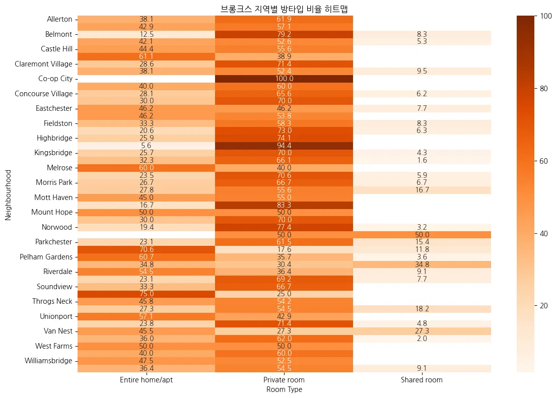
4.Bronx 지역별 방타입 분포
import pandas as pd
import matplotlib.pyplot as plt
import seaborn as sns
# CSV 데이터 불러오기
df = pd.read_csv('AB_NYC_2019.csv')
# 1. 지역별 방타입별 숙소 수
roomtype_by_area = df.groupby(['neighbourhood_group', 'neighbourhood', 'room_type']).size().reset_index(name='count')
# 2. 동네별 전체 숙소 수
total_by_area = roomtype_by_area.groupby(['neighbourhood_group', 'neighbourhood'])['count'].sum().reset_index(name='total')
# 3. 병합하여 비율 계산
roomtype_ratio = roomtype_by_area.merge(total_by_area, on=['neighbourhood_group', 'neighbourhood'])
roomtype_ratio['ratio'] = (roomtype_ratio['count'] / roomtype_ratio['total'] * 100).round(1)
# 4. 🟠 브롱크스만 필터링
bronx = roomtype_ratio[roomtype_ratio['neighbourhood_group'] == 'Bronx']
# 5. 피벗 테이블로 히트맵용 데이터 구성
heatmap_data = bronx.pivot(index='neighbourhood', columns='room_type', values='ratio')
# 6. 히트맵 시각화
plt.figure(figsize=(12, 8))
sns.heatmap(heatmap_data, annot=True, fmt=".1f", cmap='Oranges')
plt.title('브롱크스 지역별 방타입 비율 히트맵')
plt.xlabel('Room Type')
plt.ylabel('Neighbourhood')
plt.tight_layout()
plt.show()
Python
복사
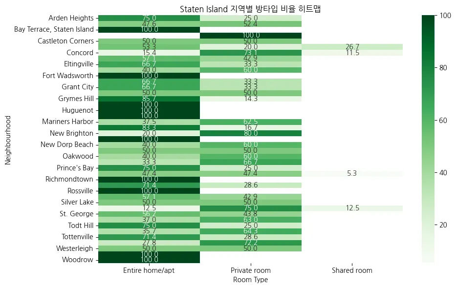
5. 'Staten Island’ 지역별 방타입 분포
import pandas as pd
import matplotlib.pyplot as plt
import seaborn as sns
# CSV 데이터 불러오기
df = pd.read_csv('AB_NYC_2019.csv')
# 1. 지역별 방타입별 숙소 수 계산
roomtype_by_area = df.groupby(['neighbourhood_group', 'neighbourhood', 'room_type']).size().reset_index(name='count')
# 2. 동네별 전체 숙소 수
total_by_area = roomtype_by_area.groupby(['neighbourhood_group', 'neighbourhood'])['count'].sum().reset_index(name='total')
# 3. 병합하여 비율 계산
roomtype_ratio = roomtype_by_area.merge(total_by_area, on=['neighbourhood_group', 'neighbourhood'])
roomtype_ratio['ratio'] = (roomtype_ratio['count'] / roomtype_ratio['total'] * 100).round(1)
# 4. 💚 Staten Island만 필터링
staten = roomtype_ratio[roomtype_ratio['neighbourhood_group'] == 'Staten Island']
# 5. 히트맵용 데이터 구성
heatmap_data = staten.pivot(index='neighbourhood', columns='room_type', values='ratio')
# 6. 히트맵 시각화
plt.figure(figsize=(10, 6))
sns.heatmap(heatmap_data, annot=True, fmt=".1f", cmap='Greens')
plt.title('Staten Island 지역별 방타입 비율 히트맵')
plt.xlabel('Room Type')
plt.ylabel('Neighbourhood')
plt.tight_layout()
plt.show()
Python
복사
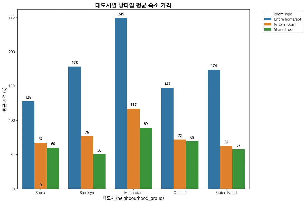
대도시별 방타입 별 평균 숙소 가격
import pandas as pd
import matplotlib.pyplot as plt
import seaborn as sns
# CSV 파일 불러오기
df = pd.read_csv('AB_NYC_2019.csv')
# 대도시별, 방타입별 평균 가격 계산
city_room_price = (
df.groupby(['neighbourhood_group', 'room_type'])['price']
.mean()
.round(1)
.reset_index()
)
# 시각화 (막대그래프 + 숫자 라벨)
plt.figure(figsize=(12, 8))
ax = sns.barplot(
data=city_room_price,
x='neighbourhood_group',
y='price',
hue='room_type'
)
# 제목 및 축 설정
plt.title('대도시별 방타입 평균 숙소 가격', fontsize=16, fontweight='bold')
plt.xlabel('대도시 (neighbourhood_group)', fontsize=12)
plt.ylabel('평균 가격 ($)', fontsize=12)
# 막대 위에 숫자 표시
for p in ax.patches:
height = p.get_height()
if not pd.isna(height):
ax.annotate(f'{height:.0f}',
(p.get_x() + p.get_width() / 2., height + 3),
ha='center', va='bottom',
fontsize=10, fontweight='bold')
# 범례 설정
plt.legend(title='Room Type', bbox_to_anchor=(1.05, 1), loc='upper left')
plt.tight_layout()
plt.show()
Python
복사
수익증대. 대도시별 지역별 잘 유지되고 있는 기준을 정해서, 분석 및 시각화 필요함.
1. 분석 목적 요약
•
단기 목표:
Entire home/apt 형태 숙소의 예약 수 증가
→ 5개 자치구 전체를 대상으로
→ “잘 유지되고 있는 숙소” 기준을 직접 설정하고, 그에 따라 분석 및 시각화
•
중장기 목표:
대도시 내 지역별 숙소 간 수익 편차 완화
→ 고가 숙소의 단순 제거가 아닌, 운영 지표를 중심으로 분석
→ 우수 숙소 패턴 도출 → 다른 지역에 확산
2. 분석 방향 및 방법론
A. 단기 목표:
‘Entire home/apt’ 숙소의 유지 상태 분석
•
분석 대상:NYC의 5개 대도시 (Manhattan, Brooklyn, Queens, Bronx, Staten Island)
•
활용 데이터 칼럼:◦
room_type: 'Entire home/apt'
◦
number_of_reviews: 누적 리뷰 수
◦
reviews_per_month: 최근 운영 여부
◦
availability_365: 연간 예약 가능일 수
•
직접 정해야 할 기준 예시:◦
리뷰 수가 n개 이상이면 ‘운영 중’
◦
최근 1개월 리뷰가 0.2 이상이면 ‘최근 활성 상태’
◦
예약 가능일 수가 90일 이상이면 ‘활성 숙소’
•
활용 방식:기준을 바탕으로 각 도시·지역별 운영 상태 분포 시각화 → 집중 관리 대상 지역 확인
B. 중장기 목표:
‘수익 편차’ 감소 및 전략적 분포 개선
•
핵심 문제:◦
단순 가격 격차가 아닌, **가격 대비 성과(리뷰·예약 가능 등)**를 봐야 함
◦
고가 숙소도 잘 운영되면 배제하면 안 됨
•
활용 지표 예시:◦
price * reviews_per_month: 실질적인 수익 가능성
◦
price * availability_365: 연간 운영가치
◦
리뷰 수 / 숙소 수: 해당 지역의 숙소 활성도
◦
평균 vs 중앙값 vs 분산 분석 → 편차 지표로 활용
•
적용 방향:◦
수익 성과가 높은 숙소의 패턴 도출 → 타 지역 확산
◦
성과가 낮은 지역은 개선안 설계 (UX, 광고 타겟, 프로모션 등)
페르소나 및 가설이 있어야 더 진행 가능
핵심 목표: 수익 증대•
단기 = 고가 호텔 예약 수 증가
•
중장기 = 수익 편차 감소 + 우수 숙소 선정 패턴 분석 적용
수익증대
어디가 가장 잘 유지가 되는가.
지역별로 따져봐서. 알아봐야 할듯, 어떤. 방타입과 어떤 가격대가
결과